Consider the old Good Humor logo. It’s perfect.
The bite out of the bar. The little square cutouts that not only draw your eye to the bar, but also present the opportunity for additional, strategically-placed icicles. The white reflections on the bar suggest it’s shown actual size. A happy, open, simple upper- and lower-case font presents the company name; a company name that doesn’t mind at all if the stick and the bar partially obscure it; they are that easy-going. Then… the all-caps “brick” of ice cream at the bottom. I’m not a designer, but is this not brilliant?
And the sheer brilliance of the name itself, suggesting that no problem exists that cannot be solved by a little ice cream and a smile. From Unilver, who now owns the brand:
In 1920, Harry Burt, a Youngstown, Ohio candy maker, created a special treat called the Jolly Boy Sucker – a lollypop on a stick. The same year, while working at his ice cream parlor, Burt created a smooth chocolate coating that was compatible with ice cream. It tasted great, but the new combination was too messy to eat. So, Burt’s son Harry Jr. suggested freezing the wooden sticks that were used for Jolly Boy Suckers into the ice cream. Burt called his creation the Good Humor Bar, capitalizing on the then widely held belief that a person’s “humor,” or temperament, was related to the humor of the palate (the sense of taste).
Times have changed. If somebody told you they had a special treat for you called the Jolly Boy Sucker… you’d call the cops. And, of course, they made a teeny little revision to the Good Humor logo in recent years:

Oh, this works, right? Designed by the same people who created the beloved biohazard logo, Good Humor picked this new logo up on the cheap at a garage sale held by The American Heart Association, who a) remind you to substitute fat-free milk and nonfat or low-fat frozen yogurt for whole milk, cream and ice cream, and b) rejected this as the AHA logo because it was ‘too clinical.’
Consider the Good Humor Truck.

Friendly, right? Clean, open, driven by the friendly man who sells Good Humors, who is outfitted in an all-white uniform and who takes this ice cream business very, very seriously.
You don’t see that guy driving one of these great old trucks on the road much any more. What you see instead is some variation on this:
 Oh, my God. This panel van contains stuff in it that people actually purchase and eat? This is not the friendly man who sells Good Humors.
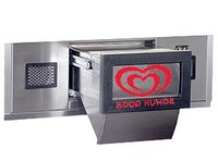
This is the man afraid to leave the truck, the man currently cowering behind the steel mesh teller’s cage, waiting anxiously for the installation of his new “Good Humor Drawer.”
More Good Humor coming this weekend.
I just learned that my grandfather, Henry J. O'Brien, created the brilliant Good Humor logo that featured the ice cream bar. Dad recalls that it was designed around the time of the war, which means it was created through my grandfather's own ad agency based in NYC. (Incidently, Grandpa also created the logo for Sunshine Biscuits, among others.)
I hope to learn more about the logo and will post any findings.